The US labor market is showing mixed signals depending on the data and time period used. Here we review some data that can help identify the divergences and put current conditions in context.
There has been much discussion about the “K-shaped” recovery in the economy following the shock of the initial lockdowns in the second quarter of this year. The “K” is meant to represent a sharp divergence between industries and workers who have been unaffected by or benefited from recent conditions (the top of the “K”), and those who have been hurt (the bottom of the “K”).
This contrasts with other “letter” descriptions tossed around that included a “V” (a rapid, broad-based rebound in activity after a sharp decline), “L” (economy weakens and remains depressed for a sustained period), or “W” (a sharp rebound followed by a second leg of weakness before a final recovery).
The data we show here highlight the “K” shaped tendencies in the labor market right now: workers who have remained employed have continued to see solid real wage gains on average, but many fewer people are working or even participating in the labor market at all. These data can help remind both investors and policy makers to look at the broad scope of data and not be distracted or misled by selected information that may make things look too rosy or excessively bleak.
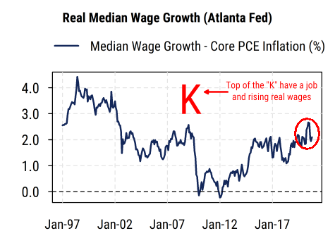
The first chart below shows the median inflation-adjusted hourly wage growth as calculated by the Atlanta Federal Reserve. It avoids the issues of changing sample composition that plagues the widely-followed average hourly earnings data by tracking wages of specific people (in aggregate) who are employed over time. It shows real wages (hourly, or salaried converted to hourly) growing at about 2% year-on-year, which is near the higher end of the range over the last 20 years and corroborates the resilient data on consumer spending this year. This captures the top section of the “K” in which those with jobs, particularly in industries that have held up or benefited from the shifts in the economy, are still seeing solid wage gains after accounting for inflation (which remains low overall).
The second chart below shows the long-term trends in employment growth, labor force growth, and the labor force participation rate. Employment growth (measured by monthly nonfarm payrolls) remains severely negative on a year-over-year basis, still worse than the trough in 2009 even after the recent rebound. Perhaps more distressingly, the labor force (the sum of all people working or looking for work) is shrinking at its fastest pace in decades, as people give up looking for work or are forced to by circumstances. This is essentially the bottom section of the “K”, where people in the most affected industries or who cannot work due to illness, caring for relatives, or closure of their business, are not only unemployed but not even really participating in the labor market at all right now.
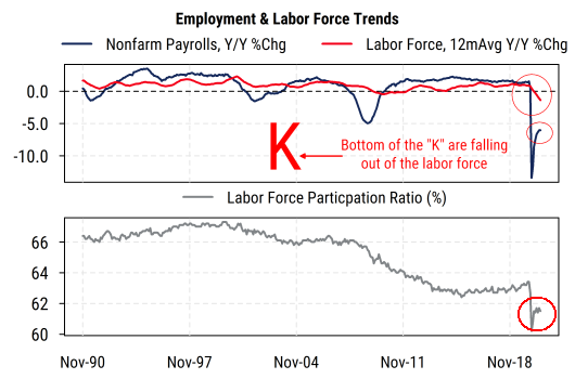
The bottom section of the chart shows the labor force participation ratio, which is the percentage of the entire US working-age population that is in the labor force (working or looking for work). It has been declining for 20 years, and after some slight pre-COVID gains has taken a big step lower this year. After an initial rebound from the lowest point earlier this year, it has been stuck around 61.5% since June. Thus a smaller percentage of people in the US are even participating in the labor market. While some of this can be explained by long-term demographic changes (more people reaching retirement age, etc.), it means that an increasingly narrow base of employed people are seeing wage gains and supporting aggregate consumer spending. The big longer-term economic policy question therefore becomes (or remains) how to broaden the labor force again and increase participation and employment, and not be misled by the apparent strength in aggregate consumer spending data that is being supported by fewer people.