July 14, 2020
Stock prices globally have remained unusually buoyant in the face of well-known health and financial risks. Thanks largely to aggressive global monetary and fiscal stimulus starting in March and still going on (though arguably fading), risk appetite jumped dramatically following the severe but relatively brief sell-off from late February to late March.
Most recently, however, several metrics of global risk appetite that we track have either plateaued or weakened. This coincides with a reduction in the pace of central bank activity and growing uncertainty about further fiscal stimulus programs, especially in the US. It also coincides with the recent turn higher in the growth of COVID-19 cases in the US and globally.
The complete explanation of the chart below follows and makes this post somewhat longer, but the key point is that multiple metrics show at least a pause if not an incipient downturn in risk appetite that is worth watching, particularly given that it occurs with the Fed and other central banks still actively pursuing asset purchase programs, even if at a less frantic pace recently.
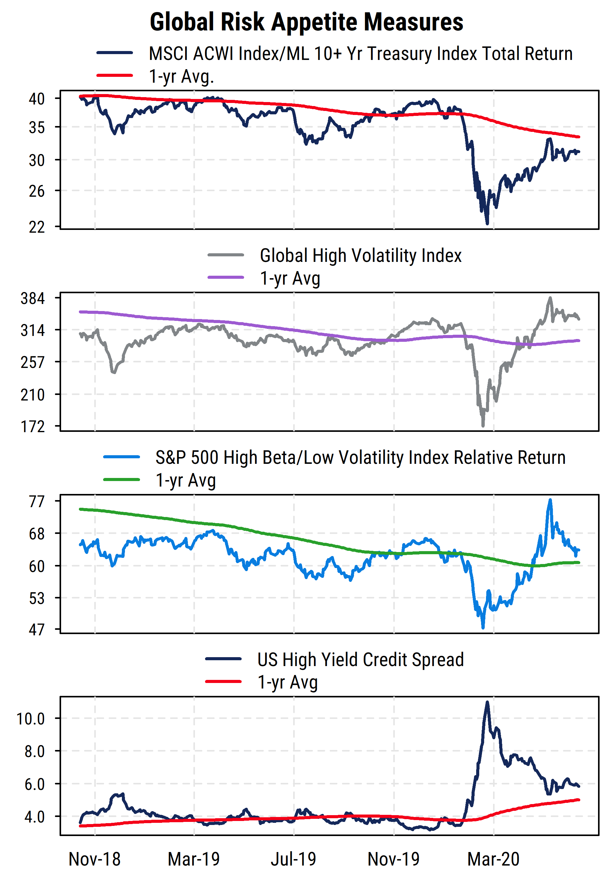
The chart above plots four price-based measures of investor risk appetite. Three are based on equity prices, and the bottom section shows US high yield credit spreads from the bond market. In all four, the preference for higher-risk assets has either lost its earlier momentum or is weakening.
The top section plots the relative return of the MSCI All-Country World Index (ACWI), one of the broadest measures of global equity returns. It includes both developed and emerging markets and has approximately 3000 constituents. Like most equity indices, it is capitalization-weighted, so the largest global companies get the most weight in the index. The US currently makes up about 57% of the weight in the index. We plot its total return relative to that of the ICE/BofA Merrill Lynch 10+ Year Treasury total return index. As its name indicates, it tracks the returns of all US Treasury bonds with 10 or more years to maturity, and thus better aligns with the long-term nature of equities as an asset class but is still considered a “risk-free” asset from the standpoint of return of principal. US Treasury bonds are a widely used global benchmark and the largest and most liquid bond market.
The relative returns of global stocks versus bonds captures the severe drop in stock prices starting in late February of this year, and the subsequent rebound. It bears noting, however, that even with the sharp rebound in stock prices, long-term US Treasury bonds have still outperformed global equities since the pandemic began (i.e., the stock/bond relative return series is lower than it was at the start of this year). The relative return series is also still below its own one-year average, which is itself declining. We also see that global stocks had struggled to outperform long-term Treasuries over a longer period even before COVID-19 became a factor earlier this year, reflecting the general weakness in the global economy developing in 2019. High total returns in bonds are potentially harder to generate now that interest rates are so low (though long-term bond prices can be quite volatile), so if stocks begin to lag bonds again on a sustained basis, it would reflect a clear shift in preference for “return of capital” rather than “return on capital”.
The second section of the chart plots our own index of high-volatility stocks globally. On a quarterly basis, we screen the global stock universe for all stocks with at least USD$200 million market cap (and at least $1 million/day average trading value) and identify those ranking in the top 10% (top decile) based on their trailing two-year price volatility (price risk). We track the daily returns of those top-decile volatility stocks as a proxy for global equity risk appetite. The index thus shows risk appetite in absolute terms, and confirms the stock/bond relative return pattern, though more dramatically. From its initial peak on January 16th 2020, the index plunged -49% to its trough on March 18th. From there it posted an extraordinary rise up to a new recovery high, gaining 123% from the low to its peak on June 8th, putting it higher for the year-to-date at that point. After a short-term sell-off from the peak, the index has been moving sideways recently, off about 10% from the June peak. It remains above its one-year average, and in line with levels seen in late 2019. The positive trend is thus arguably still intact, but has lost momentum.
The third section is somewhat similar but plots the relative returns of the S&P 500 High Beta index versus the S&P 500 Low Volatility index. These indices are constructed based on the 100 stocks within the S&P 500 with the highest market beta (sensitivity to market movements) and the 100 index stocks with the lowest historical volatility (rebalanced quarterly). The relative return series thus shows relative preferences for risk within the US equity market. It has followed a similar pattern to the global volatility index above it, but we can see a notable recent difference. The relative returns of high beta stocks versus low volatility stocks has turned down more distinctly recently, and is now back to about its one-year average. A drop below the average would potentially mark a reversal of investor risk preferences to at least neutral if not outright risk aversion, at least temporarily. We will be watching this series closely.
The final section of the chart plots the average credit spread (the option-adjusted spread, which accounts for call features on corporate bonds) for bonds in the Bloomberg Barclays US High Yield Index. Thus it measures the yield premium on high yield (“junk”) debt (rated BB/Ba or lower by Moody’s or S&P) over US Treasuries of the same maturity. A higher spread (rising line) indicates greater risk aversion and expectations of higher default risk on high yield bonds, while a lower spread indicates lower perceived credit risk. Within the fixed income market, high yield debt is closest to equity in risk, making this another useful proxy for investor risk perceptions.
This series is arguably slightly more difficult to interpret right now than it would have been historically, due to the Fed’s new direct influence on corporate debt, including high yield debt1. Nonetheless, the message is similar. After surging as COVID-19 and the associated lockdowns halted much economic activity and the corresponding ability for companies to service debt, yield spreads have come back down sharply thanks to Fed support. But most recently, the narrowing of credit spreads has stopped and may be starting to reverse. It also still remains above (worse than) its own one-year average (which would be expected given the severity of the economic weakness). The underlying fundamentals for many junk-rated companies have not improved substantially and face continued risk from the virus, but monetary and fiscal support (along with the historically low yields on “safe” debt) have increased investors’ willingness to bear credit risk recently. If that risk tolerance recedes (due to policy changes, or worsening fundamentals), both the high yield debt market and the stock market would potentially come under renewed pressure.
Overall, investor sentiment is arguably quite positive (high equity valuations, low recent demand for put options, high proportions of bullish advisors represented in surveys, etc.), and this has been reflected in returns. But the most recent price action has shown some early warning signs of stalling or reversing that risk appetite, which could lead to renewed volatility in equities.
1 While historically the Fed has been prevented from owning anything other than government-guaranteed debt, the recent legislation (CARES Act) passed in the wake of the economic and market distress allowed the Fed to act in concert with the Treasury to buy corporate and municipal debt, as well as backstopping direct loans to companies. This has directly impacted the credit spreads seen in debt markets, as intended, though at the potential cost of reducing the ability to see investors’ true risk preferences.