Based on commentary I hear and read, and questions I get asked, I thought it might be helpful to address two common “myths”, i.e., stylized assumptions or worries about the current US market and economy (with plans for more in the future).
1) The US market is excessively “narrow” – it’s just the “Magnificent 7” going up and nothing else is, and that’s a reason to worry.
Short answer: it’s not just the Magnificent 7, and “narrow” markets are not a reliable reason to sell or avoid the stock market.
While large-caps have been outperforming small-caps, that has been going on for some time and has not prevented stocks in general from posting gains. Since the start of 2023, the S&P 500 is up 32% while the small-cap Russell 2000 is up 16%. So small-caps are up less than large-caps, but they’re still up significantly.
More recently, the gains have broadened out. If it was truly just the “Magnificent 7” (or any similar tiny subset of mega-caps in the S&P 500), we would see the sectors they dominate rising and other sectors showing little or no gains. We would also see the equal-weighted version of the S&P 500 and its sector aggregates offering a very different picture.
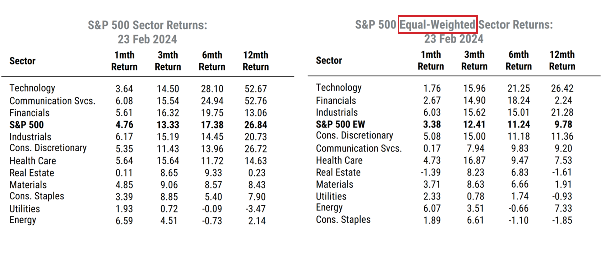
The tables below show the 1/3/6/12-month returns for the S&P 500 and the 11 GICS sectors in both the traditional cap-weighted calculations (left) and returns with each stock in the index or sector equally-weighted (right). Equal-weighting thus tracks the same stocks but removes the dominant influence of a few mega-caps on returns.
Source: Mill Street Research, Factset
We see that while the cap-weighted returns are in general higher than the equal-weighted readings, over the last 1/3/6 month periods, they are actually fairly close in many cases. The 3-month market return is 13.3% in the cap-weighted version and 12.4% equal-weighted. Over the last 6 months, the cap-weighted return is ahead of the equal-weighted, but the equal-weighted is still up 11.2%, a solid 6-month return by most any standard. And five of the 11 equal-weighted sectors show double-digit gains over the last 3 months.
Technology and Financials are outperforming in both cases, while Industrials shows almost identical returns either way. The weakest sectors over the last 6 months on both tables are the defensive or commodity-related areas of Consumer Staples, Energy, Utilities, and Materials.
Also, stock prices in other countries are rising too. The MSCI Europe index recently hit a new all-time high, as did the MSCI Japan index. So the uptrend in equities is in fact fairly broad both within the US and globally, even though some US mega-caps have outperformed.
Bottom line: large-caps have outperformed smaller-caps (in line with our recommendations to clients), but there are many stocks showing reasonably good returns, not just the few largest. Broad trends in sector performance generally align in the equal-weighted data, and non-US stocks have been confirming the general uptrend in recent months.
2) Debt levels are a major risk to the US economy
No they aren’t. Next question.
Just kidding, but that’s the short answer.
First, federal debt/deficits, as it often gets a lot of misguided attention.
US federal government debt is not the same as private sector debt, and is not excessive either way. The risk of too much federal debt growth (i.e., excessive “deficit spending”) is that it exceeds the productive capacity of the economy, not that the government won’t be able to “pay it back”.
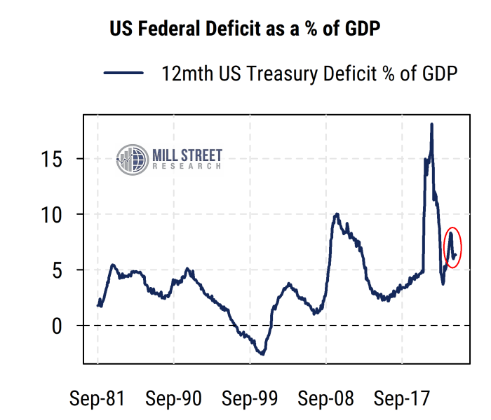
The outcome of excessive federal deficits (all else equal) would be rising inflation. While inflation was temporarily high in 2021-22, that was largely due to massive global supply shocks and temporary fiscal stimulus. The direct stimulus stopped long ago, and inflation has been declining for the last two years and is already at or close to the 2%-ish target. The US deficit as a percentage of GDP (one of various reasonable ways to scale the deficit figure) is around 6%, while in 2019 it was about 4.5%, and few were worried about inflation then, and are also not worried now, particularly with the economy growing solidly in real (inflation-adjusted) terms.
Source: Mill Street Research, Bloomberg
Also, the deficit/GDP ratio was higher than the current level for roughly four years from early 2009 to early 2013 in the post-GFC period, and there was no inflation crisis nor debt crisis.
We should in fact hope that the US federal deficit does not decline too much (and investment-driven federal spending and incentives remain in place), as it is one of the key reasons for the US economy’s solid performance. I would be much more worried about a deficit/GDP ratio of 0-2% than I would the current (or even slightly higher) one.
But what about consumers and businesses taking on more debt to sustain their spending? I heard consumer credit is now over $1 trillion.
First, any big absolute number ($X trillion) in reference to the US economy should be mostly ignored, as it is almost certainly useless without appropriate scaling or frame of reference. All numbers about the US economy are large, it’s a very big economy, and the numbers tend to get bigger over time.
The relevant figures will be either ratios comparing figures properly, or growth rates considered in light of historical trends (though COVID produced enormous temporary skews in most growth rates).
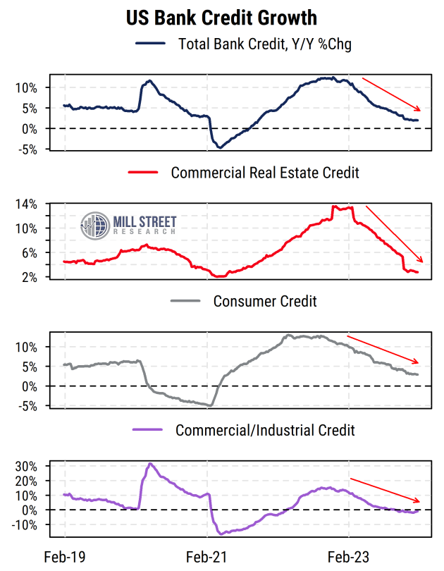
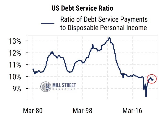
If consumers and businesses were borrowing frantically to maintain spending absent sufficient income growth, we would see it in the figures for US bank lending (credit growth). We would also see debt service costs rising sharply relative to incomes.
We see neither.
Source: Mill Street Research, Factset
In fact, bank credit growth is quite low (below 2019 levels) across the board. Consumer credit specifically is up only about 3% from a year ago, less than the current 5% median wage growth. This is indeed very much what the Fed wants to see as the result of its aggressive rate hikes: reduced credit growth, which is presumed to reduce inflation pressures.
So are consumers being crushed by higher rates? Not so far.
Debt service costs relative to income are also quite low, even though rates have been much higher for 18 months now. Debt growth has not been excessive, and incomes have grown substantially, which is where most of consumer spending comes from. Consumer balance sheets got a boost from the post-COVID stimulus programs, which will gradually fade but means consumers are not, in aggregate, likely to collapse under their debts any time soon.
Source: Mill Street Research, Factset
Without diving into the details, the same general idea applies to US companies – debt is not excessive relative to income or assets, and the banking system as a whole can likely handle the remaining losses from commercial real estate.
I will leave the mythbusting there for now, but will likely continue to address topical market “myths” in future commentary.
Sam Burns, CFA
Chief Strategist