Along with fiscal stimulus, the aggressive support of financial markets by the Federal Reserve (and other central banks) has been a key to the gains in risk assets since April. In our view, stock and bond prices would not be as high as they are if not for the perception that the Fed will step in with additional support if markets get too volatile. This perceived “Fed put” is on top of the ongoing bond buying programs (excluding the immediate post-COVID surge) that are currently running at a rate of about $80 billion per month for Treasuries and $40 billion per month for mortgage backed securities, though some of this replaces expiring bonds.
So the Fed continues to have a heavy influence on debt markets, and thus indirectly on equity and other financial markets.
The size of the Fed’s balance sheet (the value of all assets it holds) used to be far smaller relative to the economy or the markets, and only began to be a major part of the monetary policy toolkit in 2008 in response to the Great Financial Crisis. Previously, the Fed’s control of short-term interest rates was sufficient and did not require as much balance sheet activity, but once short-term policy rates hit zero in 2008 (and again this year), new tools were needed.
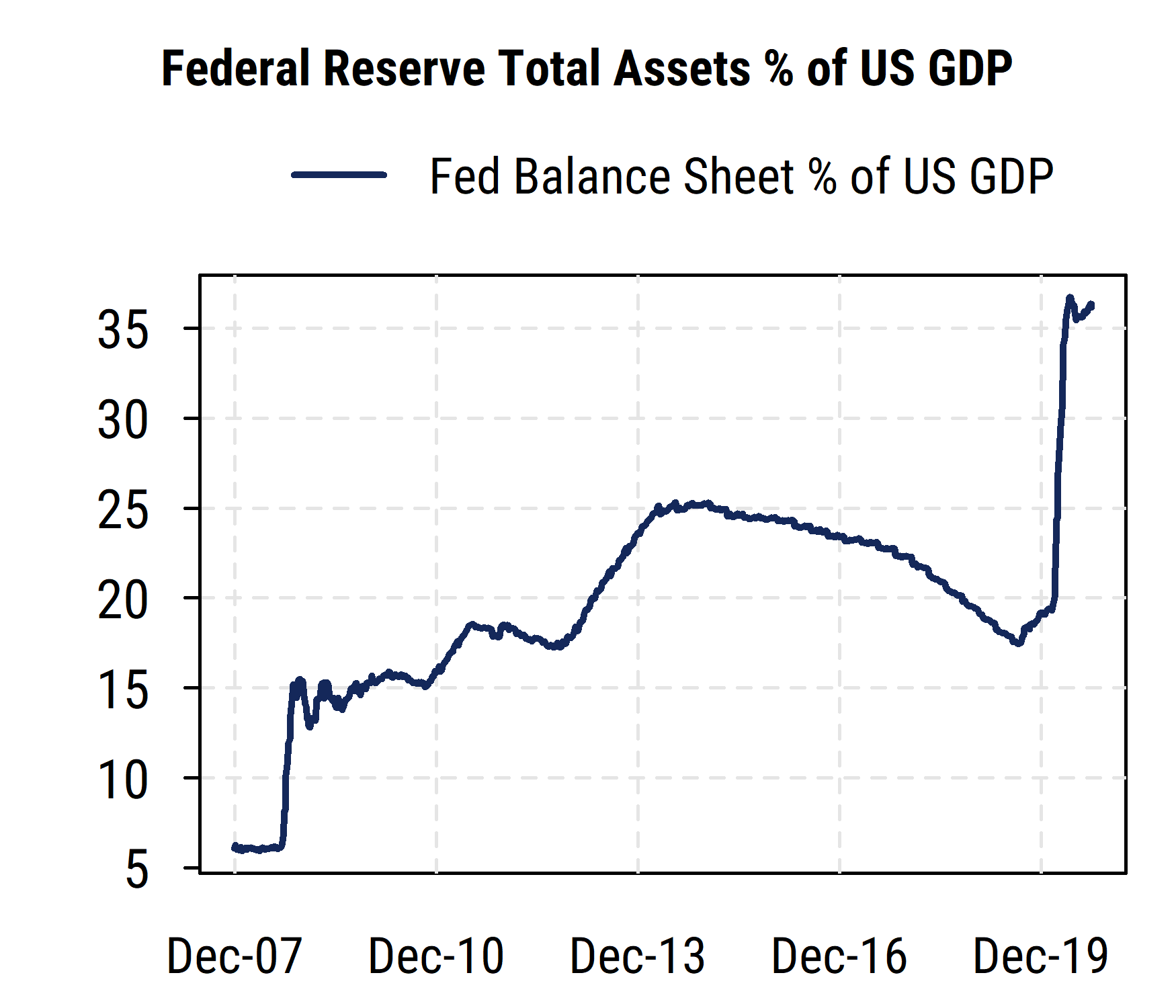
The chart below plots the ratio of the Fed’s balance sheet to US nominal GDP, perhaps the most common way of putting the Fed’s monetary policy actions in perspective. From a pre-crisis level of around 6% of GDP in 2007, three rounds of quantitative easing (“QE”, or bond buying) starting in 2008 pushed the ratio up to about 25% of the size of the US economy in 2014. Then the Fed allowed some assets to “roll off” (bonds maturing and not being replaced with new ones) and effectively shrink the balance sheet relative to the economy. Several years of such a policy brought the balance sheet back to about 18% of GDP in early 2019.

This appears, in hindsight, to have been too small a size for the Fed’s balance sheet nowadays. It is important to recall that even before COVID hit earlier this year, in mid-2019 the Fed began lowering rates and adding to its balance sheet again to ward off interbank funding strains and signs of weakening economic growth. Then in response to the COVID-related shutdowns of the economy, the Fed made its most aggressive balance sheet movement to date. It bought nearly $3 trillion in Treasury, mortgage-backed, and other bonds very quickly, pushing its balance sheet size up to its current record level of about $7 trillion. This is now about 36% of US GDP.
While comparing the Fed’s assets to the size of the economy is a relevant comparison, we should also keep in mind that financial markets have generally grown faster than the economy. So it is also worth considering the Fed’s balance sheet in relation to the size of the debt and equity markets.
Notably, even with huge issuance of Treasuries recently to finance the US federal budget deficit, the Fed now owns over 20% of all publicly held Treasuries, more than it has in at least 20 years.
And it owns more than 30% of the mortgage-backed bond market, similar to what it owned in the aftermath of the Great Financial Crisis (which was heavily tied to the mortgage and housing market). This has helped push mortgage rates to all-time lows recently.
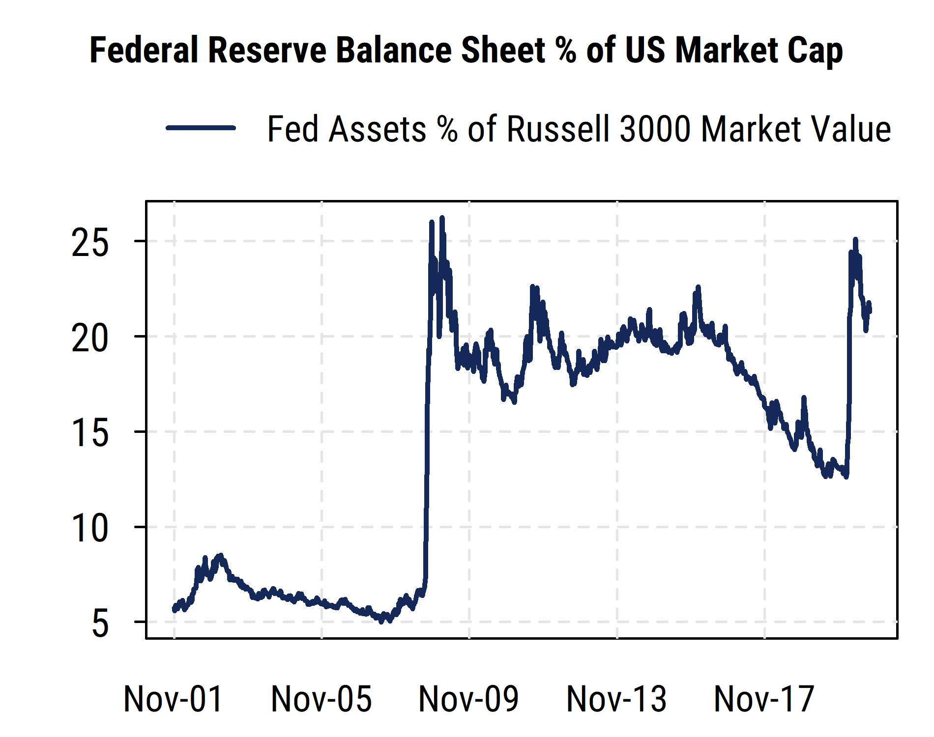
The chart below, however, plots the Fed’s balance sheet relative to the size of the US equity market. Now, to be clear, the Fed does not own US stocks (at least not yet, though other central banks like those in Japan and Switzerland do buy stocks), so this is just another way to scale the size of the Fed’s balance sheet (bond holdings) that may be of more interest to equity market participants.

We compare the value of the Fed’s assets to the total equity market capitalization of the broad Russell 3000 index (the 3000 largest US companies). The picture there is notably different than the one using GDP as the scaling metric.
The initial surge in 2008-09 is very stark, pushing the balance sheet from around 7% of equity market cap up to a peak around 25%. Then the balance sheet oscillated around 20% of US equity market value as the Fed’s bond buying was roughly in line with the growth in the equity market through 2016. When the Fed began allowing its balance sheet to gradually decline, stocks continued higher and thus the Fed’s assets dropped sharply to a low of around 13% of equity market cap in 2019.
The Fed’s actions this year have provoked another jump in the ratio, but the change relative to the stock market has been less than that seen in 2008-09, due to the larger size of the stock market. The peak earlier this year was around the same 25% level relative to US equity market value, and since then the gains in stocks have outpaced the Fed’s buying of bonds and pushed the ratio back down somewhat. The Fed’s assets now equal about 21% of US equity market value, not far from the average level during the 2009-2016 period. This reflects the fact that the stock market has grown significantly faster than US GDP in recent years as equity valuations have risen.
We can thus see that while the Fed is more involved than ever in financial markets by some metrics, by others it is not far from the ranges it has inhabited since the Great Financial Crisis started 12 years ago. And we should keep in mind that other central banks (Bank of Japan, European Central Bank) have balance sheets even larger relative to their economies or their financial markets. So the Fed could certainly continue expanding its asset purchases further before it would approach the relative size of some of its counterparts.
The Fed is thus both limited and nearly unlimited: it can print money to buy bonds (including corporate bonds now), i.e., make loans, in almost unlimited quantities, but cannot determine how the money they print is used (or not used), and cannot give outright gifts or grants. Only Congress, via the Treasury, can distribute truly “free money” that does not have to be paid back. And recent headlines suggest further delays in new fiscal policy support. That leaves the Fed as the main provider of market support, at least for now.