The latest weekly report on unemployment claims was released yesterday and provoked mixed responses depending on how the data was (or was not) analyzed. While unemployment claims data is not a perfect measure of the national job market, it is one of the most timely measures and gives a good picture of what is going on (though long-term comparisons can be difficult). Recent methodology and seasonal adjustment changes along with reporting of state-only (not federal) claims data have caused some confusion among investors.
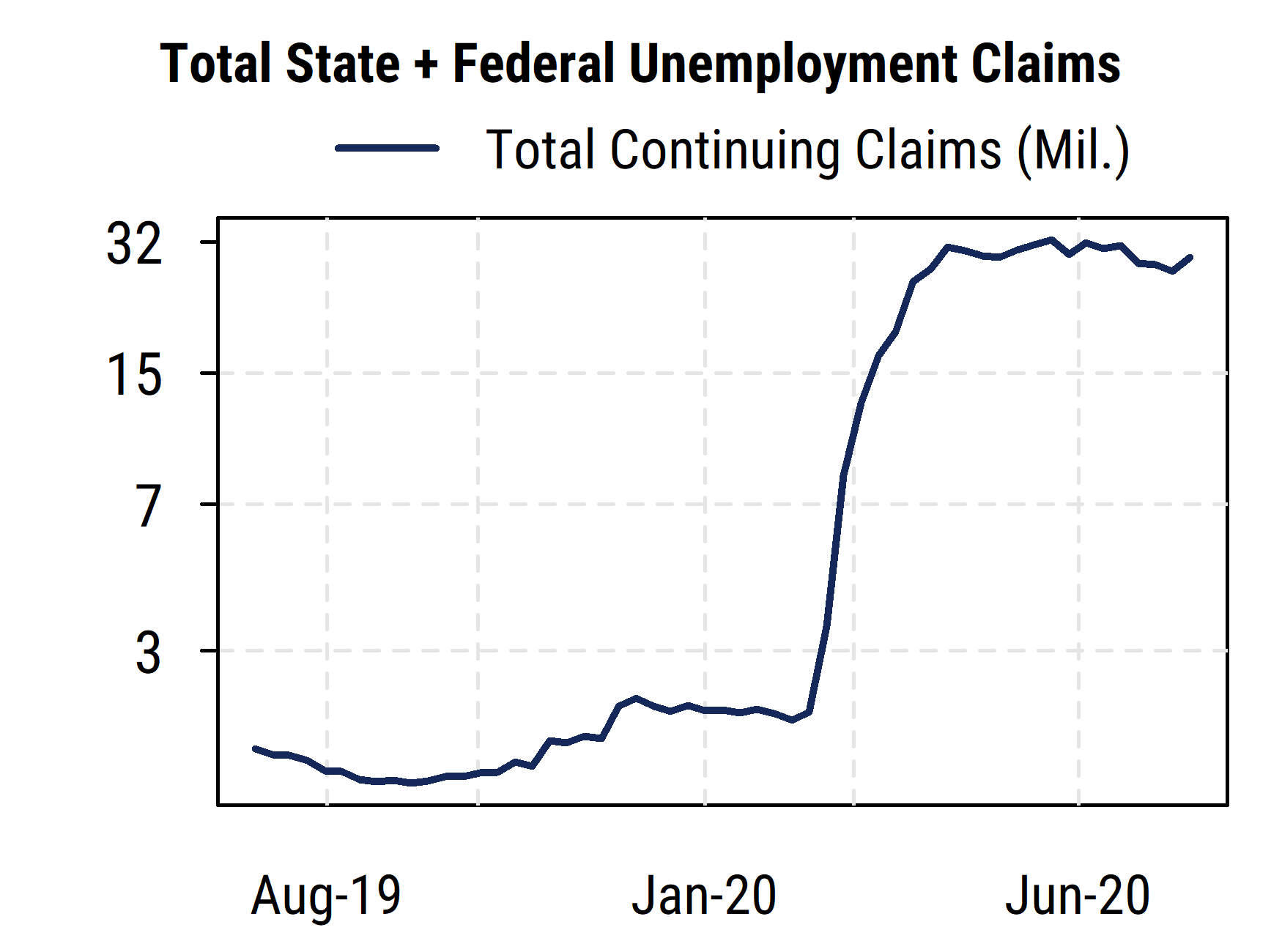
The chart below shows the current preferred measure of ALL continuing (not initial) unemployment claims over the last 12 months, i.e., including the total of all the newly created or expanded federal unemployment assistance in addition to the regular state-level unemployment benefits that are normally reported. The data are not seasonally adjusted, and are shown on a log scale to better capture percentage changes. The picture is pretty clear: the trend in unemployment has not improved materially since May despite the signs of a rebound in economic activity. The positive side is that more unemployed people than ever before are getting at least some benefits while out of work thanks to the expanded federal support programs started in April (far more so than in the 2008-09 Great Recession). This highlights the economy’s current reliance on federal fiscal support.

We can see that before February there were around 2 million people getting unemployment benefits (and fewer than that most of last year), which were all from regular state-level programs, and since May there have been steadily between 27 and 30 million people getting benefits from state and federal programs combined. The latest data (for Aug. 15th) shows the number back to the upper end at 29.2 million. The US labor force (people over 16 deemed working or looking for work) as of the end of 2019 was about 159 million people. So over 18% of the pre-pandemic labor force is now collecting some kind of unemployment benefits, with no real trend of improvement visible yet.
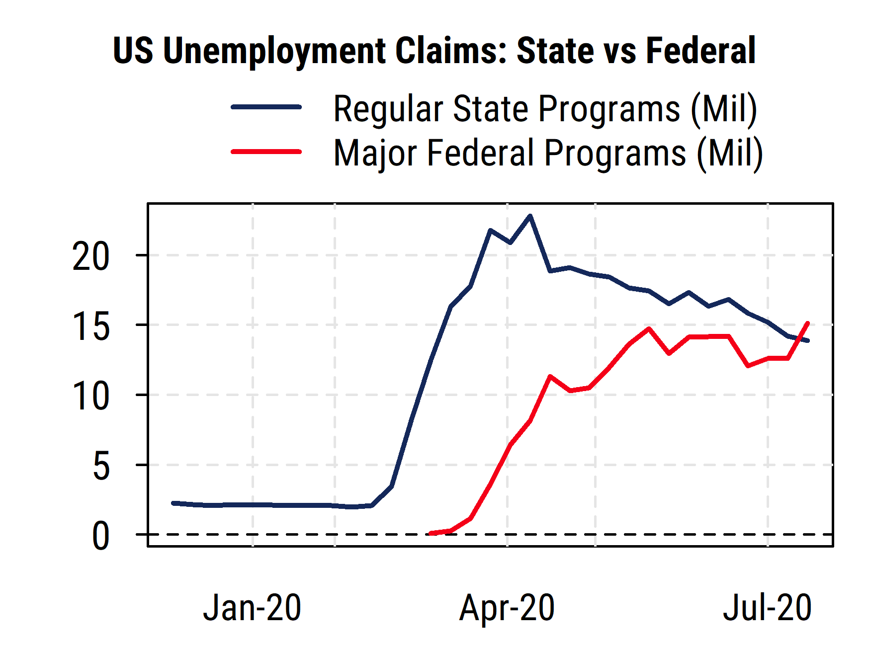
Since part of the confusion about the weekly claims reports is related to the presence of the new federal programs in addition to the standard state programs, we break down the two categories in the chart below. Many state unemployment benefits normally only last 26 weeks, though there have been extensions in some cases. The major federal programs (Pandemic Unemployment Assistance, PUA, is the largest, with Pandemic Emergency Unemployment Compensation, PEUC, the other major one) are designed to both expand who can receive benefits (self-employed, gig workers, people working to support family at home, etc.) and extend the duration of benefits when state programs run out. As the months have passed, some people originally on state benefits (or who would normally have been ineligible) have switched over to the federal programs. We can see this in the chart, where the state-level data (blue line) has been declining from its peak, but the federal programs (red line) have been rising to largely offset the decline in the state data. Indeed, the total in federal programs has now exceeded those in state programs for the first time. This is why the total for all programs together has shown no material improvement (as in the first chart above), but those watching only the standard state-level data argue that employment conditions are improving.

While the supplemental benefit of $600/week for many of those getting benefits expired at the end of July, the benefits from federal support programs (PUA) are due to run out at the end of this year unless they are extended. Thus there will continue to be much attention focused on Congress as they debate if and how to provide additional economic support, with much uncertainty especially as the November elections approach.