A key differentiating element of Mill Street’s research is the intersection of “top-down” and “bottom-up” inputs to asset allocation decisions. That is, a lot of strategists and researchers focus mostly on top-down indicators like GDP, inflation, retail sales, employment and other macroeconomic data to drive their views on which countries or regions to invest in, or which industry sectors to allocate to. I look at those variables too, but they can be hard to use for allocation purposes (as discussed further below), so I also lean heavily on bottom-up indicators of earnings, stock prices, and valuations based on aggregating data from Mill Street’s 6000+ stock global database.
This is particularly true for regional equity allocation, i.e., deciding which countries or regions to allocate to within an equity portfolio. Of course, some investors only invest in their home market and ignore the rest of the world, but many of Mill Street’s institutional clients have global mandates that require considering where in the world to allocate their equity capital.
Macro data can be tough to use for active investment purposes
While there is no doubt that macroeconomic data is critical to understanding the global economy and the backdrop for each country or region, it can be difficult to use for real-time investment decisions. As many investors and analysts know, most economic data is released with a material lag (often weeks or months), is subject to historical revisions (often multiple revisions), and often does not really measure what the investor wants it to (or thinks it does). The situation is compounded when trying to do cross-country analysis, since countries all differ in the macroeconomic data they produce: scope of data, definitions, and timeliness all vary widely. And if even a certain data series is timely and accurate, it still may not really measure what an investor wants to track. Equity investors, for instance, are mostly interested in data that is relevant to publicly listed companies, which represent only a portion of all companies, and companies represent only a portion of national aggregates like GDP.
Secondly, we have to keep in mind that markets move mostly when new information (like from macro data) diverges from consensus expectations. So an investor who accurately predicts that GDP (for instance) will be reported up X% may not be successful using that information to earn excess returns unless they also know whether the market was already anticipating that result (like in sports betting where picking the winner of a game is not enough, the winner has to “beat the spread” that is set based on the consensus of the betting public in order to win a bet). Thus, using macro data has to include some implicit or explicit assumptions about market expectations. And while there are often published surveys of expectations for economic data (as there are for company earnings), those surveys may not fully reflect the actual market consensus, and thus a seemingly positive or negative “surprise” can lead to unexpected market responses.
And in some cases, the relationship between economic data releases and market movements is not based simply on the meaning of the economic data itself, or even its divergence from consensus, but rather on the perceived response to it by monetary or fiscal policy makers. That is, if investors are in fact more interested in what policy makers will do rather than the actual fundamentals, then interpreting macro data for investment purposes requires the assumption of a “reaction function” by the relevant policy makers. So if, say, GDP is stronger than expected, that would sound like good news for equities and other risk assets. But if investors expect monetary policy makers to respond to stronger GDP growth by tightening monetary policy (raising rates) on an implicit assumption that higher GDP brings higher inflation, then equities could focus on the bad news of an unfavorable policy response rather than the apparent good news of better-than-expected economic activity. This brings the common debate about whether “good news is bad news” or “good news is good news” for investors in a given circumstance.
Finally, since investors must make relative allocation decisions (between stocks, bonds, and cash, or among various regional equity markets and currencies, or types of debt, etc.), they must successfully analyze the relative responses of policy makers in response to economic data, and then the relative responses of markets from that. That is, if economic data points to a rate hike by the Federal Reserve, but other countries also have data pointing to their central banks raising rates, then the investor has to analyze how much (if any) the relative attractiveness of US markets will change compared to other markets.
All of this (and more) generally means that the path from the release of economic data to a useful market prediction, particularly a relative view among multiple countries, is a long and winding one. Again, this does not mean one should ignore all macro data, but be cautious about using it directly to make precise short- or intermediate-term market predictions.
The view from the bottom up: aggregated earnings estimate revisions
My own frustration with trying to use macro data for quantitatively-driven market allocation decisions years ago drove me to look for more direct methods of analyzing the trends in relative fundamentals across markets. The goal was to combine the macro data and market price data (relative returns) that have long been used with a third source of information that would be closer to what I wanted to measure and not suffer from the lags and historical revisions that macro data does, nor the short-term noise that prices often show.
My research on stock selection, meanwhile, highlighted the value of tracking changes in (revisions to) earnings estimates by equity analysts as a near-real-time proxy for fundamentally relevant news or “surprises” for companies. Following on research going back to the 1980s, in my own research I found that relative earnings estimate revisions activity is a solid cross-sectional predictor of relative stock returns over 1-6 month horizons (with trends that can go on for much longer in some cases). If analysts are changing (revising) their earnings estimates, then almost by definition, some “new news” has come along that was not already incorporated into their forecasts. Good news will produce upward revisions to earnings estimates, and bad news will produce downward revisions, but only if the news was not already anticipated and is relevant for the company’s financials. The other key point is that trends in analyst estimate revisions tend to be persistent over the course of months. So once a trend is identified in estimate revisions, we can have much more confidence that it will continue next month and the month after than we would for relative price return trends.
So the next logical step was to see if aggregated earnings estimate revisions would be useful for cross-country (and cross-sector) analysis. That is, do countries or regions that have stronger earnings estimate revisions tend to do better than those with weaker revisions, in the same way that individual stocks do? In general, the answer is yes, and using those aggregated earnings-based indicators has been useful in analyzing regional equity allocation.
Where in the world are the strong earnings trends?
Regional trends in underlying earnings estimates can often be persistent for months or sometimes years at a time. This makes them much more of a stable anchor to regional allocation views than relative returns might be, since returns can be volatile and noisy (driven by non-fundamental news in the short run). Ideally, fundamental trends and relative returns will align, giving a stronger signal than either individually.
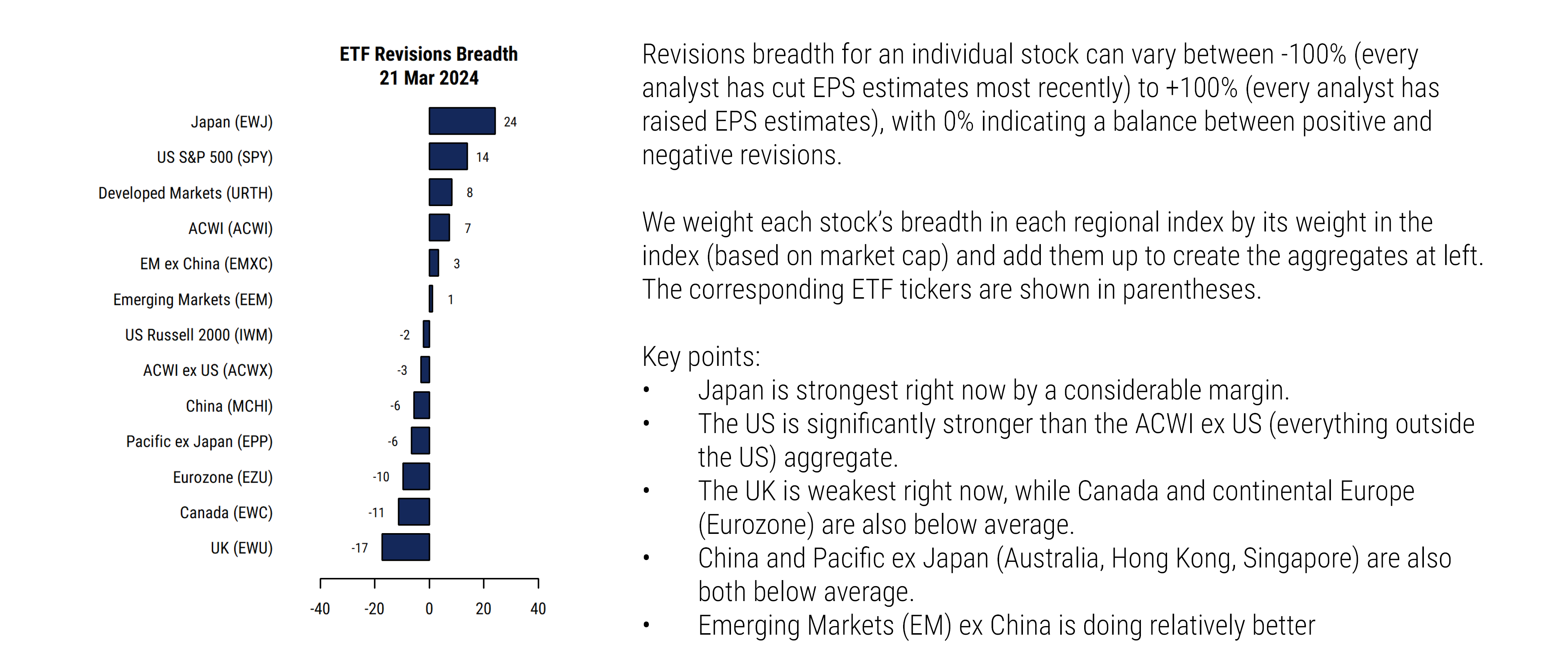
What do the aggregated earnings estimate revisions data tell us now? The message in recent months has been that Japan and the US have the strongest earnings trends, particularly on a cap-weighted basis, while Emerging Markets (especially China) have been weak, along with developed Asia ex Japan (often tied to China), Canada, and Europe.
Source: Mill Street Research, Factset
Looking at the bottom-up earnings data alongside macro data highlights that Japan’s economy is doing better than many expected, and is being helped by the weakness in the yen (good for Japan’s exporters) and its persistently loose monetary policy (despite the recent policy shift by the Bank of Japan). The US has benefited from much better-than-expected economic growth (even in the face of aggressive Fed tightening) helped by US fiscal policy and better recovery from COVID-related shocks, as well as US domestic energy production. The US stock market and earnings also benefit from the heavy exposure to successful Technology-related companies (not found in Europe or Canada, for instance).
China’s weakness on earnings trends is corroborated by news of weakening economic growth, widespread problems with real estate and debt, government crackdowns and interference in certain industries, a developing trade war with the US, and a much weaker response to COVID. Europe and the UK have struggled more with their fiscal responses to COVID shocks as well as the impact of Brexit, exposure to higher energy costs, and the relative lack of big Technology companies.
One of the “big trades” of recent years: US vs EM
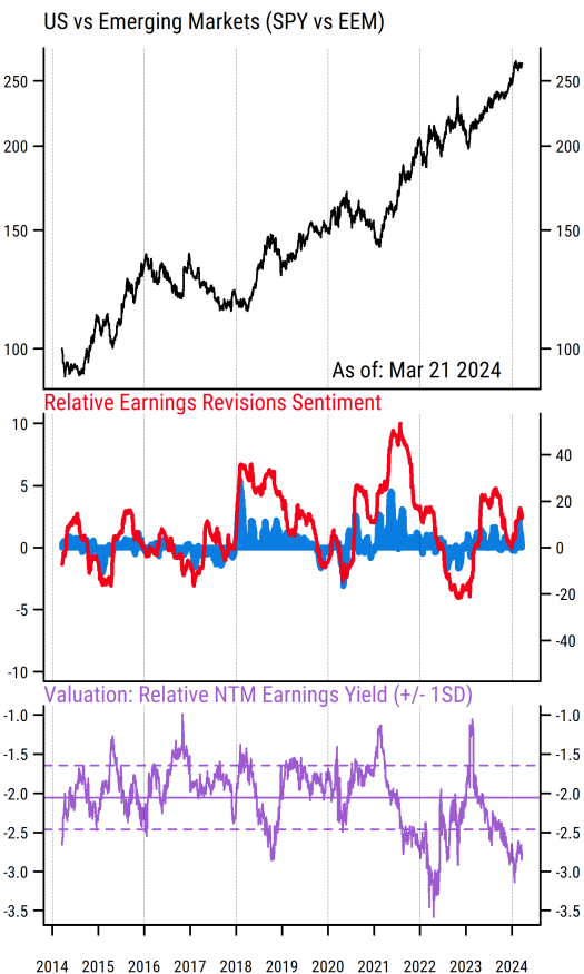
One example of a big regional relative allocation view that has been supported by bottom-up fundamentals and relative returns for quite some time now is looking at the US versus Emerging Markets (reflected by the S&P 500 and MSCI Emerging Markets indices and their ETFs, with tickers SPY and EEM). The US has been outperforming EM for much of the last decade, and especially since late 2020, as reflected in the rising black line in the top section of the chart below (i.e., SPY/EEM relative return).
Source: Mill Street Research, Factset
The red line in the middle section of the chart is the relative earnings revisions breadth for US vs EM, meaning the difference in aggregate cap-weighted earnings revisions breadth (percentage of analysts raising estimates net of lowering estimates, aggregated across companies in the index) between the US and EM. So readings above zero mean US earnings revisions are stronger than those of EM, and vice versa. We see that the red line and blue bars have been above zero for the strong majority of the time since 2014, and remain solidly in favor of the US now. This tells us that the fundamentals in the US have been and remain stronger than those of EM, and thus fundamentals support the relative return trend.
The bottom section of the chart captures the relative valuation of US vs EM. It shows the difference between the next-12-month (NTM) earnings yield for the S&P 500 and that of the EM index. The spread has been negative for all of the last decade or more, meaning US stocks have always been more expensive (higher P/E, or lower earnings yield) than EM in absolute terms. This is to be expected given the greater risks in emerging markets, as well as the weaker earnings trends reflected in the middle section.
The latest readings show the US relatively more expensive vs EM than it has been historically (the solid dashed line is the 10-year average difference in earnings yields), which is not surprising given the extent of the outperformance over the last 12 months: the S&P 500 (SPY) is up 33% while the EM index (EEM) is up just 5%. Even with stronger US earnings, the valuation gap has widened.
In my work, the trend in the relative fundamentals and the relative return trend are more important for the 1-6 month outlook than the valuations, though valuations can be useful for gauging longer-term risk and the extent to which good news or bad news may be priced in. In the case of US vs EM, there is certainly a case to be made that structural risks for EM, and more specifically for China (which still comprises 23% of the index even after extensive underperformance), have increased and thus reduced the “fair value” valuation of EM.
GDP growth does not necessarily equal earnings growth
The other point to keep in mind is that many investors have focused on the reported GDP growth in markets like China to argue that their stock markets are undervalued compared to the seemingly slower-growing US market. There are at least two important issues with this argument, though: 1) GDP data in countries like China is unreliable as a true gauge of activity, 2) GDP growth has not correlated well at all with underlying corporate earnings available to shareholders. While China’s GDP growth has been reported at anywhere from 5 to 10% in various years over the last decade, the earnings per share for the MSCI China index have in fact not grown at all. The index-level EPS for MSCI China is slightly lower now than it was 10 years ago, a stunning divergence from the apparent high GDP growth. The S&P 500, by contrast, has shown EPS growth of about 7% per year over the last decade, among the highest of the major regions. Thus it is far less surprising to see that Chinese stocks have underperformed not just US stocks but the rest of Emerging Markets as well.
Bottom-up fundamentals help avoid narrative “traps” and noise
The key point, though, is that the bottom-up indicators have been crucial in constructing my regional allocation views and confirming or refuting macro-based narratives. This is particularly true for US vs EM and given the long history of investors and strategists arguing that “EM is cheap so you should buy” or “the trend has gone too far and must reverse soon”, which have thus far been wrong. I have been underweight EM in my regional allocation recommendations (and specifically relative to the US) to clients continuously since May 2021 (and frequently before then as well), based in large part on indicators like these.
Using multiple inputs and getting confirmation from different types of indicators remains a core principle of Mill Street’s research, and this applies fully to global equity allocation. Building a global stock database and a comprehensive suite of aggregated indicators from it has taken a lot of time and effort, but it is both valuable to clients (who can avoid trying to do it themselves) and gives me much more confidence as a strategist that I am focusing on the relevant objective data and not getting caught up in narratives or noise.
Sam Burns, CFA
Chief Strategist